Case Study
Gordon-Conwell
2018 Redesign
In the fall of 2018, I was hired as Director of Marketing & Communications for Gordon-Conwell Theological Seminary — midway into a major site redesign trending over budget and off-track. Don’t worry; this story has a happy ending.
Provided Services
UX Design | Development | SEO | Project Management
Live Website
GordonConwell.eduOverview
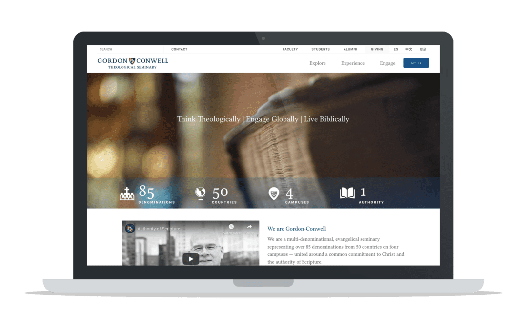
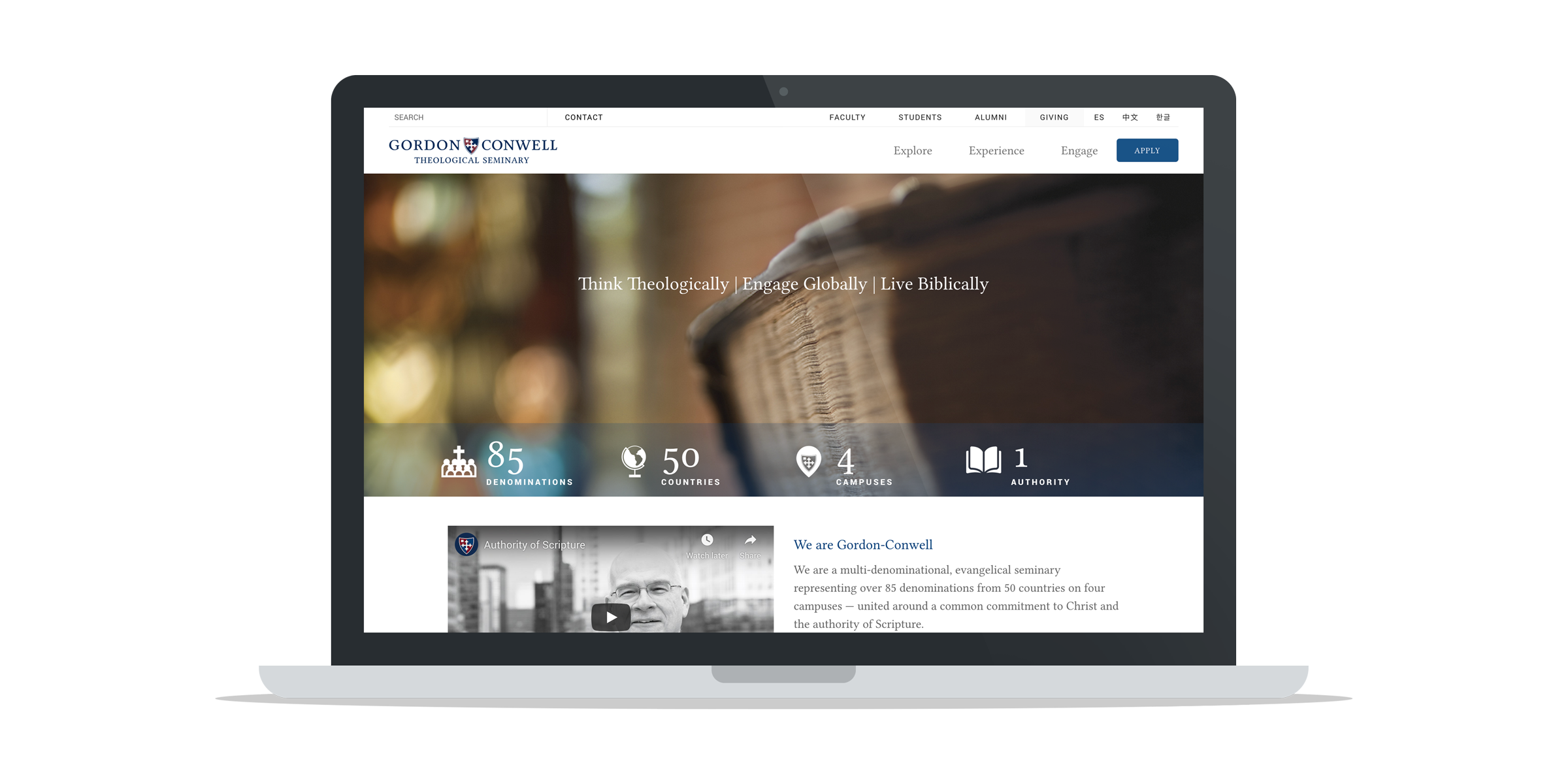
The pre-existing site was a confusion of competing stakeholders. I was hired midway through a redesign quickly veering into the same morass. However, I helped to pivot the project to a staged solution, highlighting user-focused successes and building progressively to a successful, conversion-focused resource.
The Challenge
Gordon-Conwell’s 2013 web redesign proved unfortunate on several fronts. The expense of a proprietary Content Management System (CMS) overtaxed the school’s shrinking budget. The redesign failed to include a mobile responsive solution (at a time when it should have). And the site’s information architecture showcased dozens of compromises between competing internal stakeholders disregarding a consistent user experience.
Understandably, unique visitors and traffic continued to decline year over year (YoY) after the launch of the new site. By 2018, the site was still not mobile-friendly, resulting in both poor user experience and SEO penalties. Dwindling traffic was propped up by increased advertising spend despite the financial burden of the proprietary CMS.
I was hired as Director of Marketing & Communications in the fall of 2018, midway through another redesign. The school had already invested in a one-time expense to move the site to an open-source CMS (WordPress). However, internal stakeholders were still competing for pride of place in the structure of the site. We were halfway through the project’s original scope (which was quickly creeping), 2/3 through our schedule, and 3/4 through our budget.
The Solution
This project required many skilled professionals. I am indebted to the overall UI provided by our art director, Nicole Rim, and custom theme development from our contracted agency, Floodlight. For the purpose of highlighting my contribution to the success of this project, I want to focus on three connected solutions that unified our fragmented stakeholders around the first stage of a consistent, conversion-focused UX.
1. Personas
I entered the project with top-down buy-in to focus on prospective students at the expense (when necessary) of current students, alumni, faculty, centers, and institutes. Nevertheless, we still had to contend with four campuses and two pseudo-campus programs all functioning as semi-autonomous schools loosely connected by a common name.
Using demographic data researched by our six “campuses,” I developed a series of 30 proto-personas. Admittedly, this overwhelming host of personas was laughably insufficient to unify UX decisions. This was an intentional compromise to allow each of our stakeholders to view their perceived core users. In the process, however, the personas pushed stakeholders to discuss design decisions in terms of user goals. This was the first key success.
“Personas pushed stakeholders to discuss design decisions in terms of user goals.”

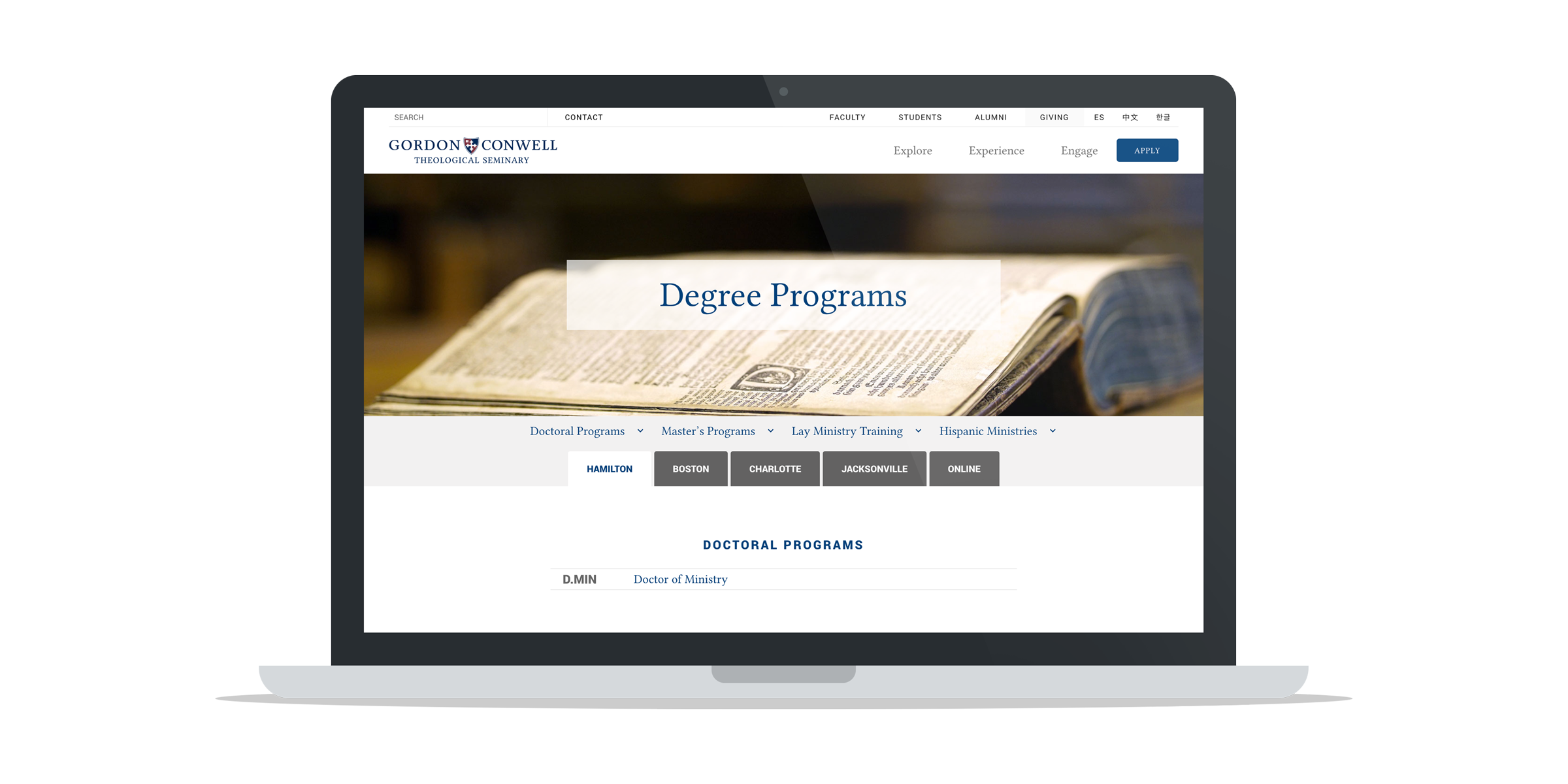
2. Data-Driven User Flows
My second key solution was using analytics to demonstrate consistent user flows. Notably, our degree program page — which had two variant URLs — was the single highest destination page for the first, second, and third interaction.

This should not have been a surprise. Our degree page served as the catalog of our primary ‘products.’ Nevertheless, many stakeholders assumed prospective students explored faculty and campuses before diving into programs. The data defied those assumptions. Our prospective students were far more pragmatic than previously believed. This was the second key success.
3. Campus Tabs
My third key solution was to organize the content of pages under a series of tabs related to our four campuses and online modality. On the back end, we created administrative roles mirroring our campuses and gave content owners the ability to edit specific campus sections per page.
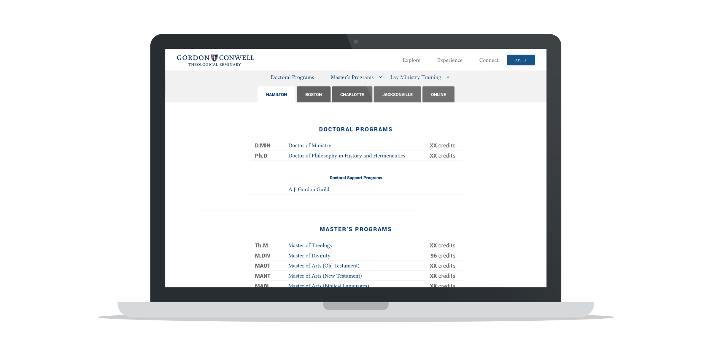
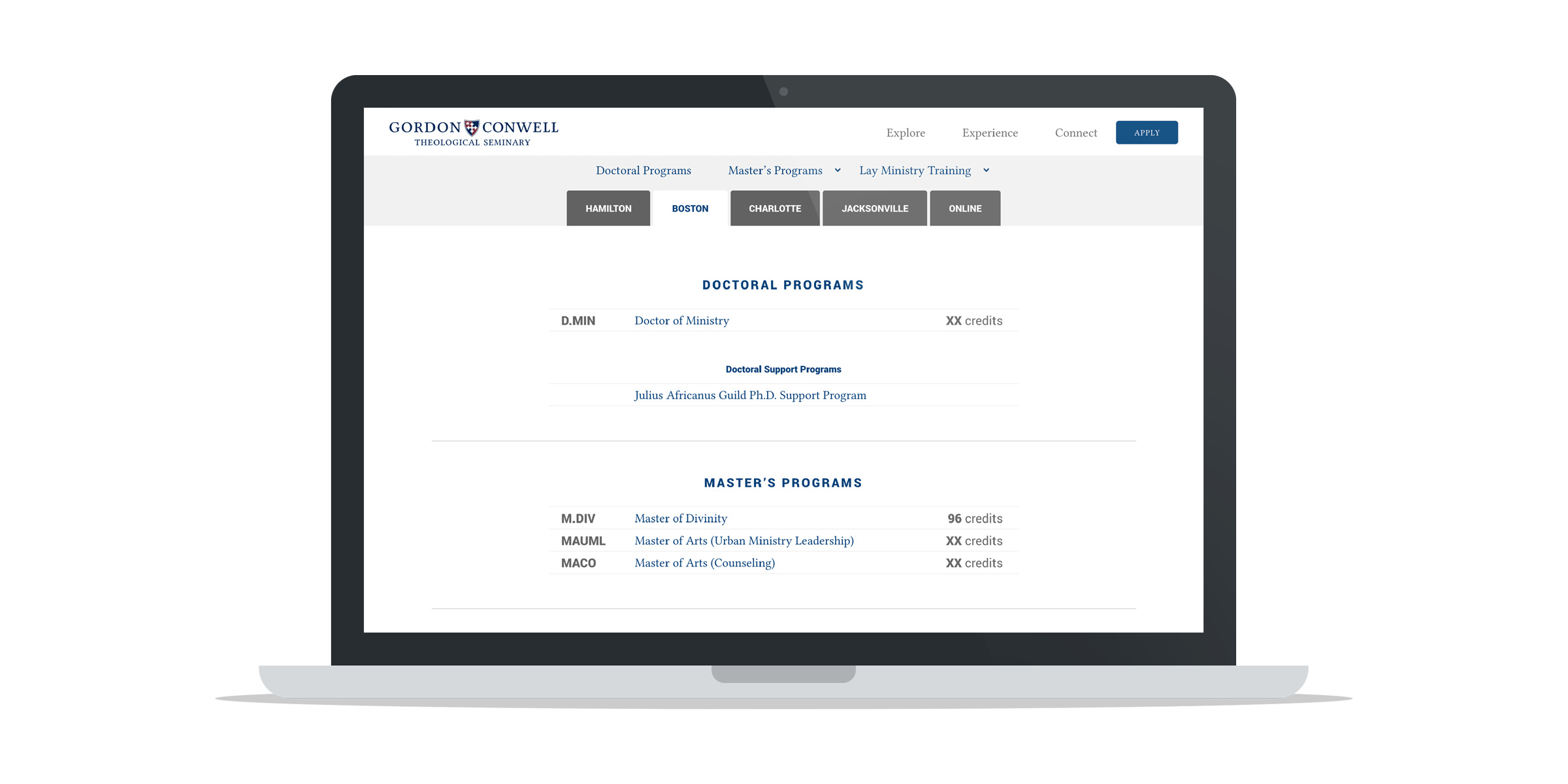
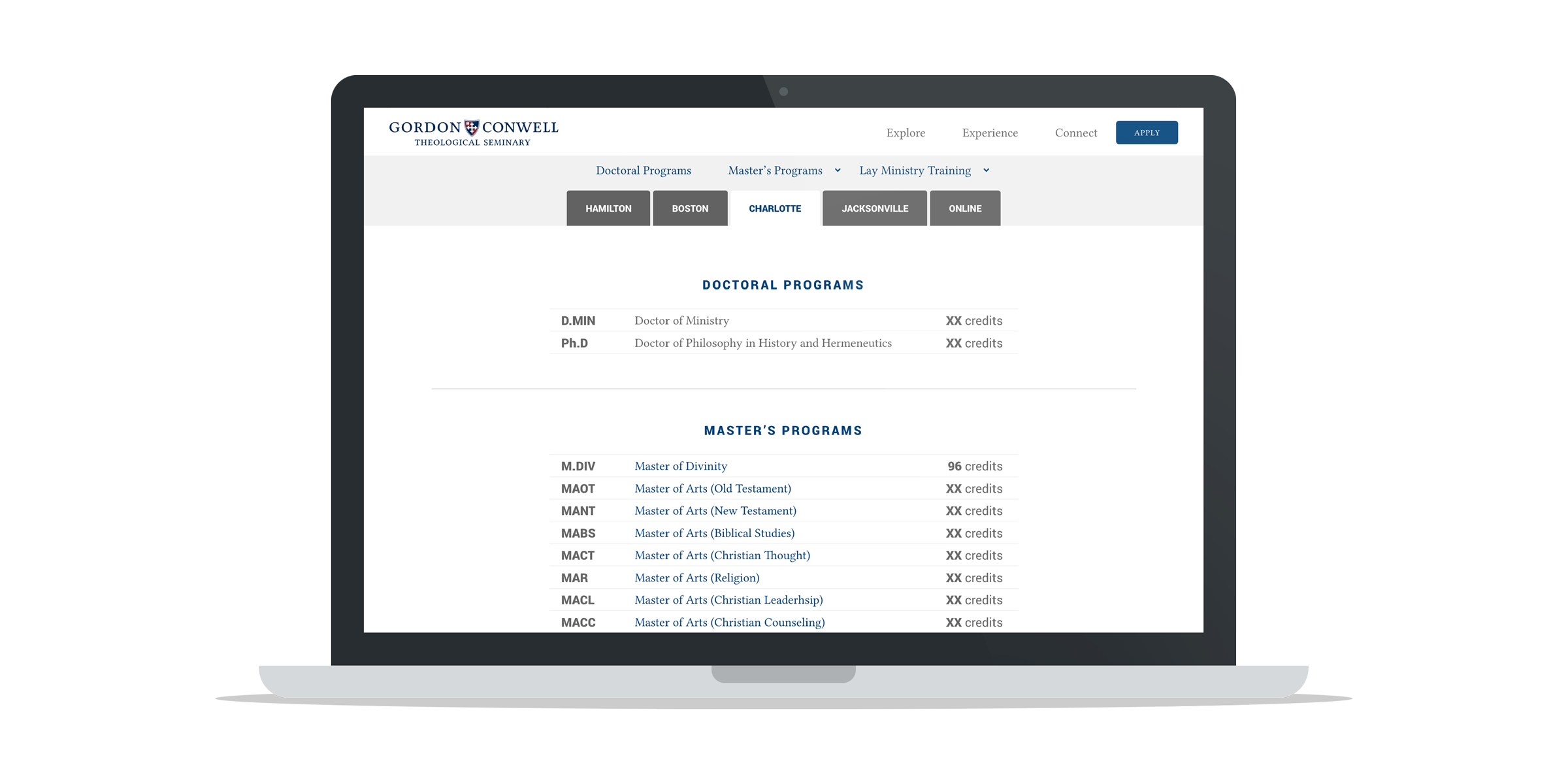
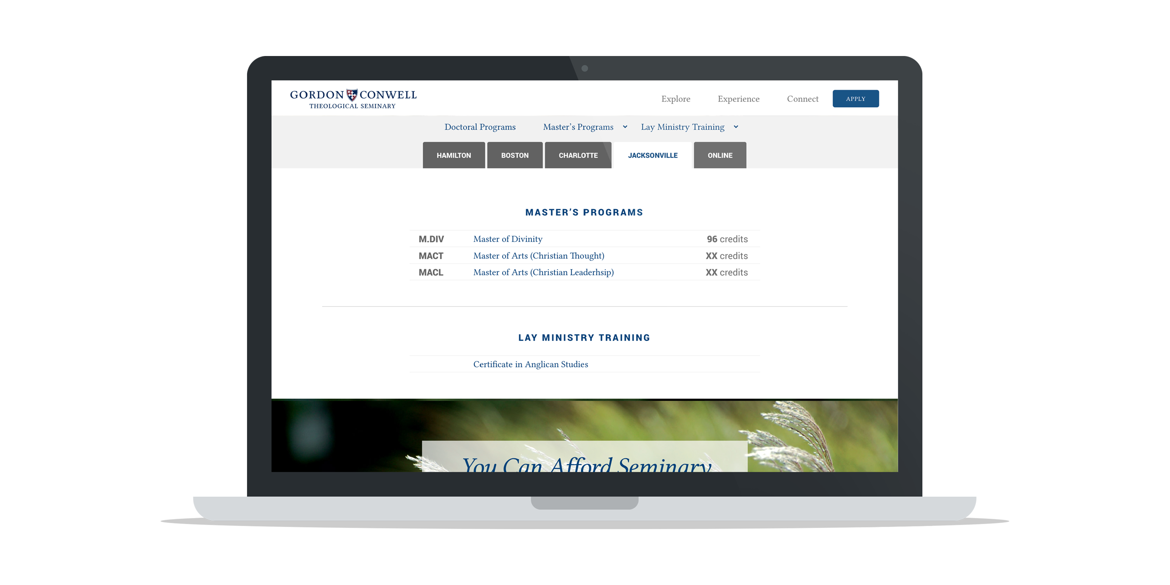
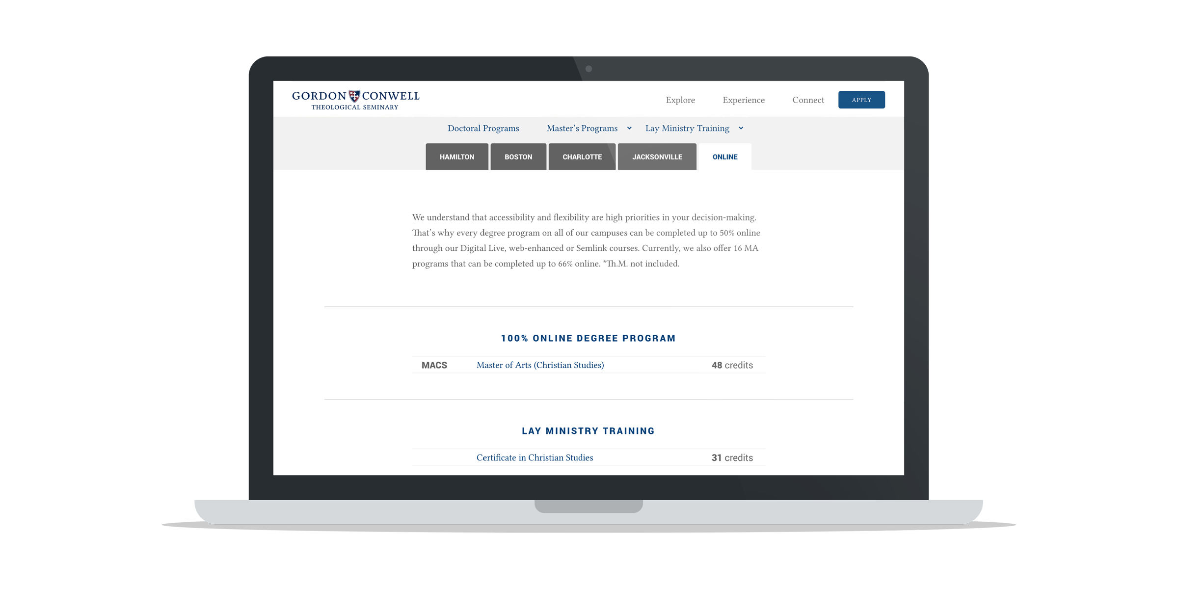
This relatively simple UX solution had dramatic implications for the site’s information architecture.
Prior to this, our stakeholders depended on driving users to their specific (campus-based) sub-sites. These sub-sites varied wildly in structure owing to exaggerated misperceptions of the uniqueness of “our users.” This practice was unnecessarily competitive and confusing for users.
The data-driven user flows (above) demonstrated that all stakeholders depended on a common user flow. The tab structure empowered us to drive users through consistent page flows that could be campus-specific or campus agnostic depending on the particular need of a given page.
This also meant that content owners began developing content in parallel (on the same page). Over time, increasingly parallel content allowed us to simplify pages and reduce dependency on the tabs.
Results
In the first quarter after the redesign, page views increased by 65% while the average time on page decreased by 66%. The bounce rate decreased by a staggering 91% and exit rate decreased by 57%. In other words, users spent significantly less time on pages while clicking through to more pages.

%
Page Views
%
Time on Page
%
Bounce Rate
%
Exit Rate
On our degree page (the most critical page in user flows), results were even more pronounced:
%
Page Views
%
Time on Page
%
Bounce Rate
%
Exit Rate
After a full year, cumulative page views had still increased by 63%. This was the first real growth in traffic in over a decade.

Conversions
You might be wondering, “What about conversions?” Growth in traffic is important only if it leads to conversions, right?
In my next case study, I will demonstrate how a redesign of our inquiry system (in concert with improved traffic) led to a 185% increase in leads.
Hooray For GCTS … What About You?
Let’s Achieve Measurable Results Together!
"*" indicates required fields


Recent Comments